
The Most Important Chart in AI Is Also the Most Misunderstood
When a metric becomes a meme, it gains in popularity what it loses in precision.

For those who believe that artificial intelligence is the most important technology of our lifetime, one chart dominates the discourse. You may have seen it once, or several thousand times. It looks like this.
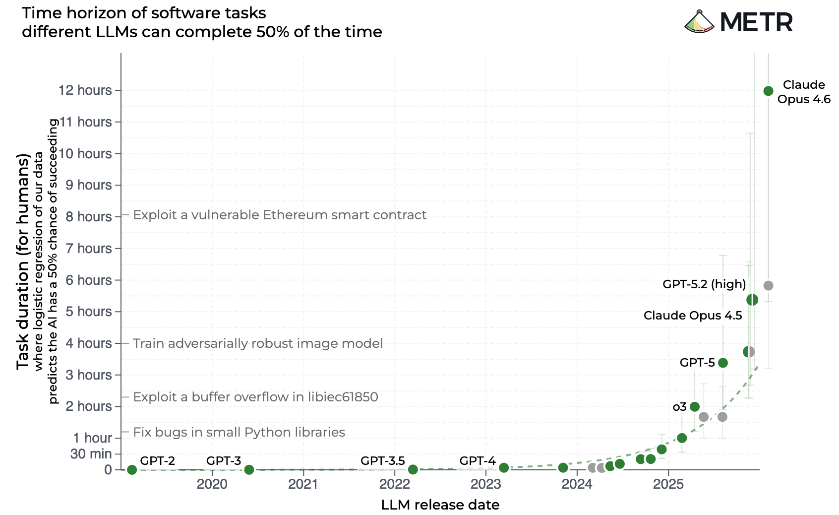
A brief explanation for the uninitiated, starting in the top right corner. “METR,” or Model Evaluation & Threat Research, is a non-profit organization that assesses the abilities and safety of cutting-edge AI. The X axis shows the dates that various AI models came out. The Y axis is … well, hoo boy, it’s complicated. For now let’s just say it estimates how good each model is at doing real human tasks, as measured by how long it takes people to do the same things. The line swooshing upward suggests something like: Holy shit, these silicon buggers are getting very good, very fast, at doing human work.
As if following the Moore’s Law of AI, these models seem to be doubling (at least) their ability to do complex and useful tasks every three to four months. When ChatGPT came out in November 2022, the best AI model could finish a 30-second task, like answering a multiple-choice test. This February, METR announced that the latest offering from Anthropic could complete computing tasks that take humans more than 14 hours.
METR’s analysis is load-bearing for AI advocates who predict that the technology is about to achieve escape velocity. To put things a bit more meme-ishly for the visual learners out there:
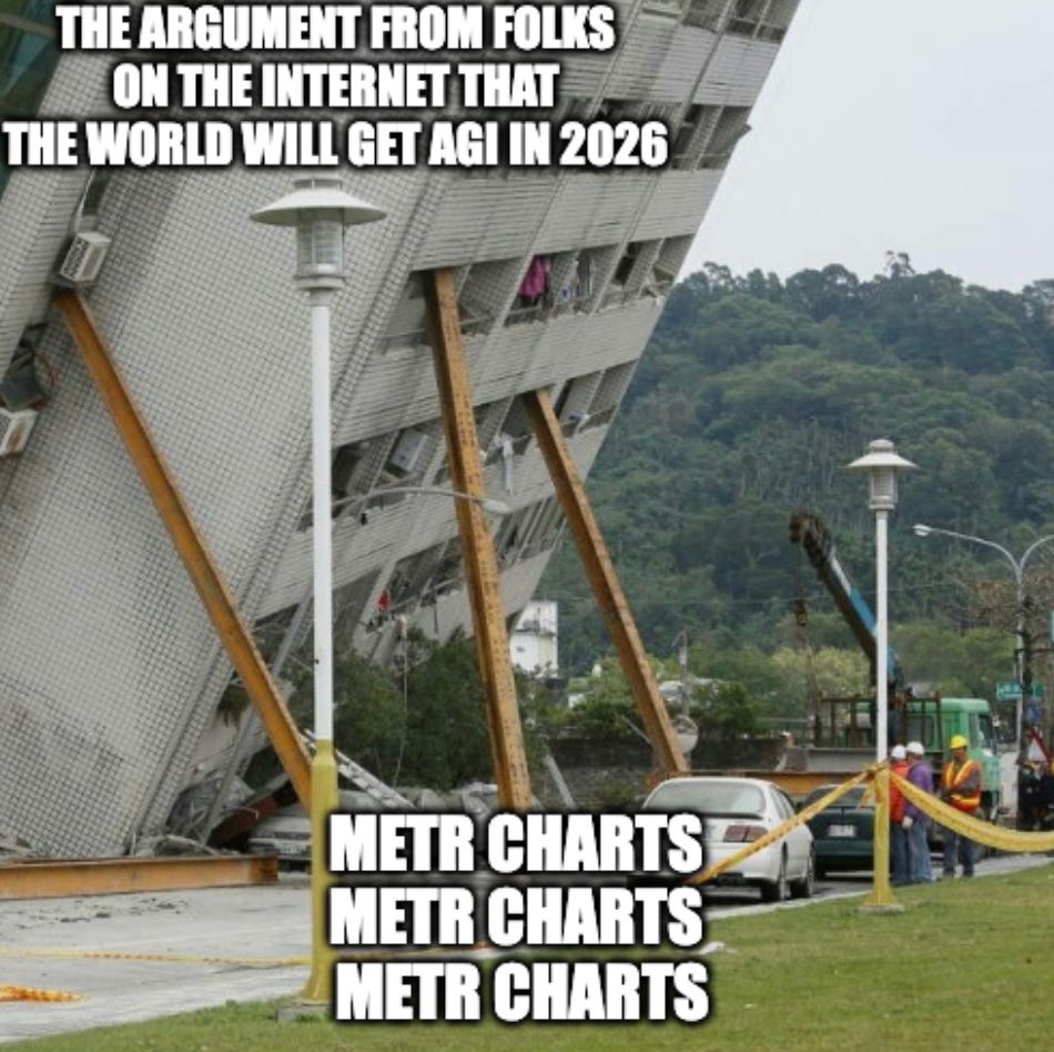
Many people are familiar with Goodhart’s law: When a measure becomes a target, it ceases to be a good measure. I think we need an update for 21st century discourse: When a measure becomes a meme, it gains in popularity what it forfeits in precision. That is, when a metric or chart becomes a totem of the discourse, it often takes on meanings and implications that are either false, misleading, or unintended by its original makers.
To get the throat-clearing done with: I think AI’s technical progress has been incredible, and I think the folks at METR are doing their earnest best to capture its rate of improvement. But even the organization’s employees are urging people to look more closely at what their research is and is not saying. “There are a bunch of ways that people are reading too much into the graph,” Sydney Von Arx, a member of METR’s technical staff, told Grace Huckins at MIT Technology Review.
After speaking to METR employees and reading their own explanations of the METR task measures, I’ve determined that there are several major misunderstandings about this chart. This isn’t a mere fact-checking exercise. I think a more realistic and nuanced understanding of this famous chart actually gives us the clearest possible understanding of where AI is headed and why it’s likely to be both more chaotic than AI skeptics believe and less economically impactful than most AI boosters predict.[Paid subscribers can read the full analysis below, plus the final takeaway.]
Myth #1: The METR chart measures AI’s ability to take over all human jobs.
Reality: Nope.
